Olpaka 0.4: Harder, Better, Faster, Stronger
Over the past few weeks, my mind has been busy with various thoughts. But one in particular has stood out…
What codenames should I use for Olpaka releases!? :P
Since all the coolest projects have distinct names, and I want to add something more personal to this project, moving forward, all Olpaka releases will be named after iconic songs that have shaped the soundtrack of my life.
And boy, have I got a name that fits like a glove the next release: “Harder, Better, Faster, Stronger” from Daft Punk! It’s like it was made for this release, so let’s get this party started!
Harder
Diving into a new technology, language, or framework is always a challenge. And when you’re tackling them all at once? Well, let’s just say it’s not for the faint of heart. But hey, I’m all about finding simple solutions that I can wrap my head around.
I’ve definitely had to work harder than usual to master all of the above.
Better
Welcome to the What’s New segment of this post! It’s time to unveil some exciting upgrades that have been in the works. Here’s a rundown of all the improvements:
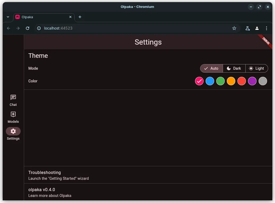
- New Settings Tab: Now, users can personalize the app’s look and feel by changing colors and theme modes!
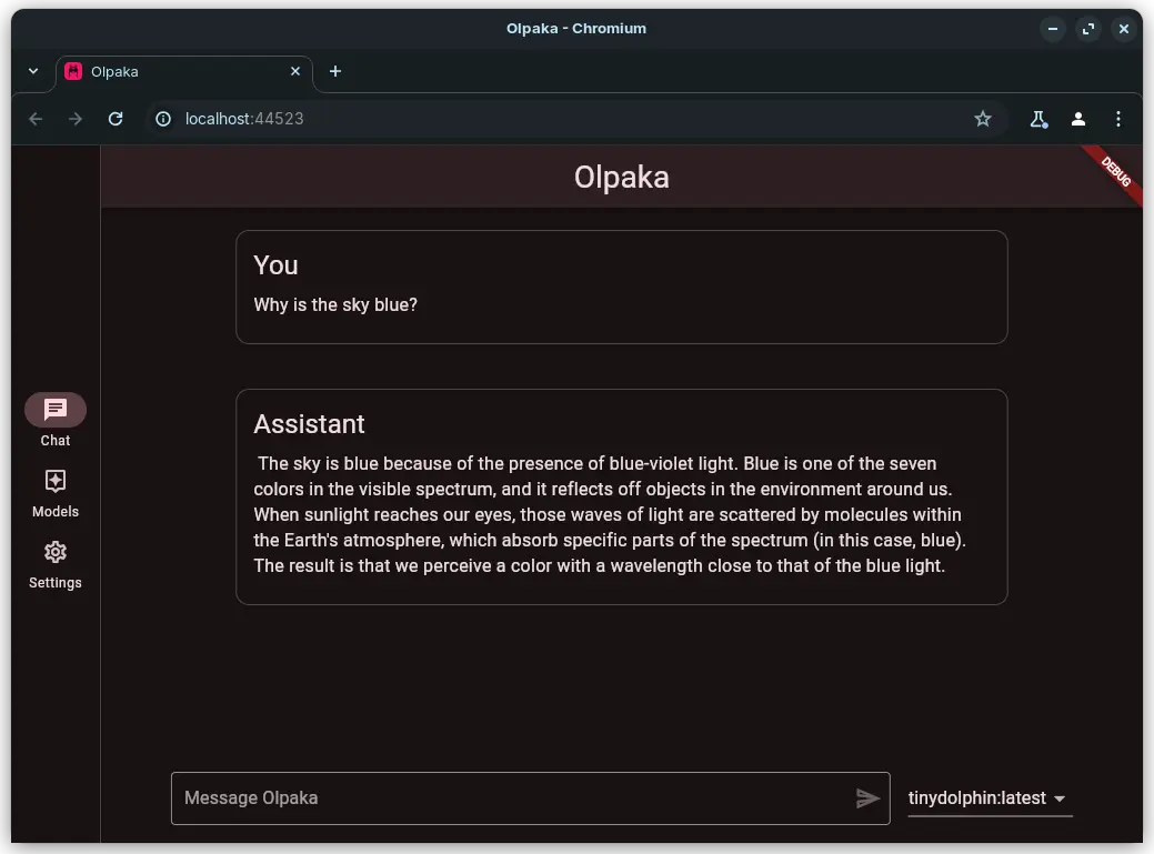
- Chat enhancements:
- From this release, every word generated by ollama is displayed in real-time, cutting down on tedious seconds of waiting;
- Conversations will be kept when navigating away from the chat tab;
- I’ve simplified the conversation bubbles to be more subtle and centered, ensuring better message readability;
- Chats are now context-dependendent: follow-up message will be always based on chat history;
- Model management tweaks:
- A progress bar tracks the progress of your models’ download;
- If you want to play with the app’s theme while it’s downloading a model, now there is a badge that helps you figure out whether your download is still ongoing or has completed!
With all these enhancements, I’m sure that your experience will be nothing short of … better than ever before!
Faster
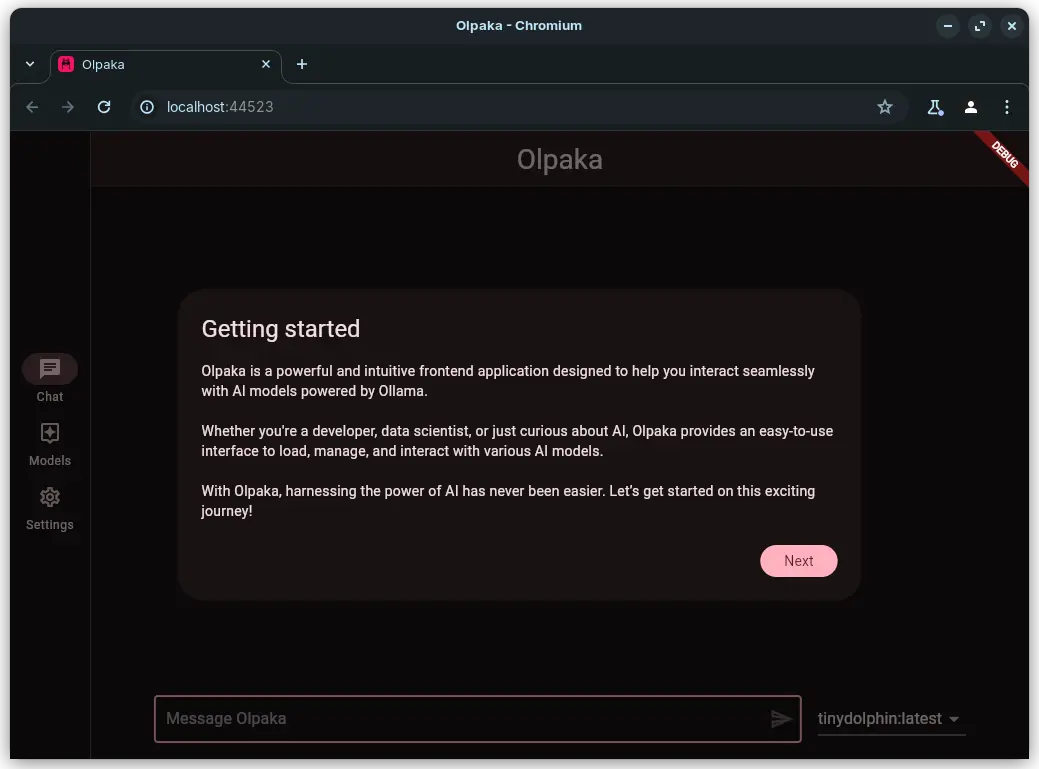
I’ve been on a mission to eliminate as much friction as possible. Say goodbye to those pesky onboarding screens (I called it!): the app will guide you on what needs fixing and how to fix it, right when you need it!
A “Getting Started” screen will be now shown only once. When the user completes the flow, this will not be visible anymore. However, it can still be accessible from the Settings tab.
With the same spirit I’ve refined the approach to error handling: instead of bombarding the user with dialogs, the app is now showing non-blocking error states.
These changes will supercharge the user’s workflow, making everything run smoother and definitely … faster!
Stronger
I’ve rewritten the app almost from scratch at least three times before finally landing on something that feels just right.
Along the way, I’ve tackled countless challenges and bugs (and, let’s be real, probably introduced a few new ones in the process), endlessly redesigned components until they fit my taste. I’m finally happy with the simple yet effective structure I’ve landed on.
Well the above process was intrumental to forge a definitely… stronger architecture.
Ready to give it a spin? Check out the “Olpaka web app” link above! 😊